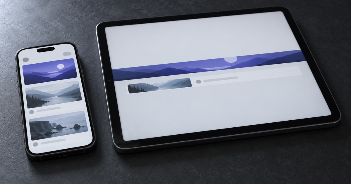
A stretched phone layout is responsive in the narrowest sense and unusable in every sense that matters. It fits. Every pixel of the window is covered, nothing overflows, no yellow-and-black stripes in the corner. And the thing the screen was supposed to tell you is gone, cropped out of a bitmap, or pushed four hundred pixels below where your eye starts.
Two of my own FlutterFlow UI templates were captured at 393 px and at 1024 px on 2026-09-29, and both fail in exactly that way. Neither has a layout bug you could file. Both are broken.
What does adaptive actually mean in Flutter?
Responsive means the content fits the space; adaptive means the interface is usable in that space. Flutter's own documentation draws the line cleanly: "responsive design is about fitting the UI into the space and adaptive design is about the UI being usable in the space" (Adaptive and responsive design in Flutter). The same page adds the question that actually decides your architecture: should a tablet UI use bottom navigation or side-panel navigation?
That distinction sounds academic until you measure a real screen. A responsive failure throws an overflow error and you fix it in ten minutes. An adaptive failure ships, passes review, and quietly costs you the first impression on every tablet your app runs on, because nothing anywhere reports an error.
Two layouts that fit and still fail
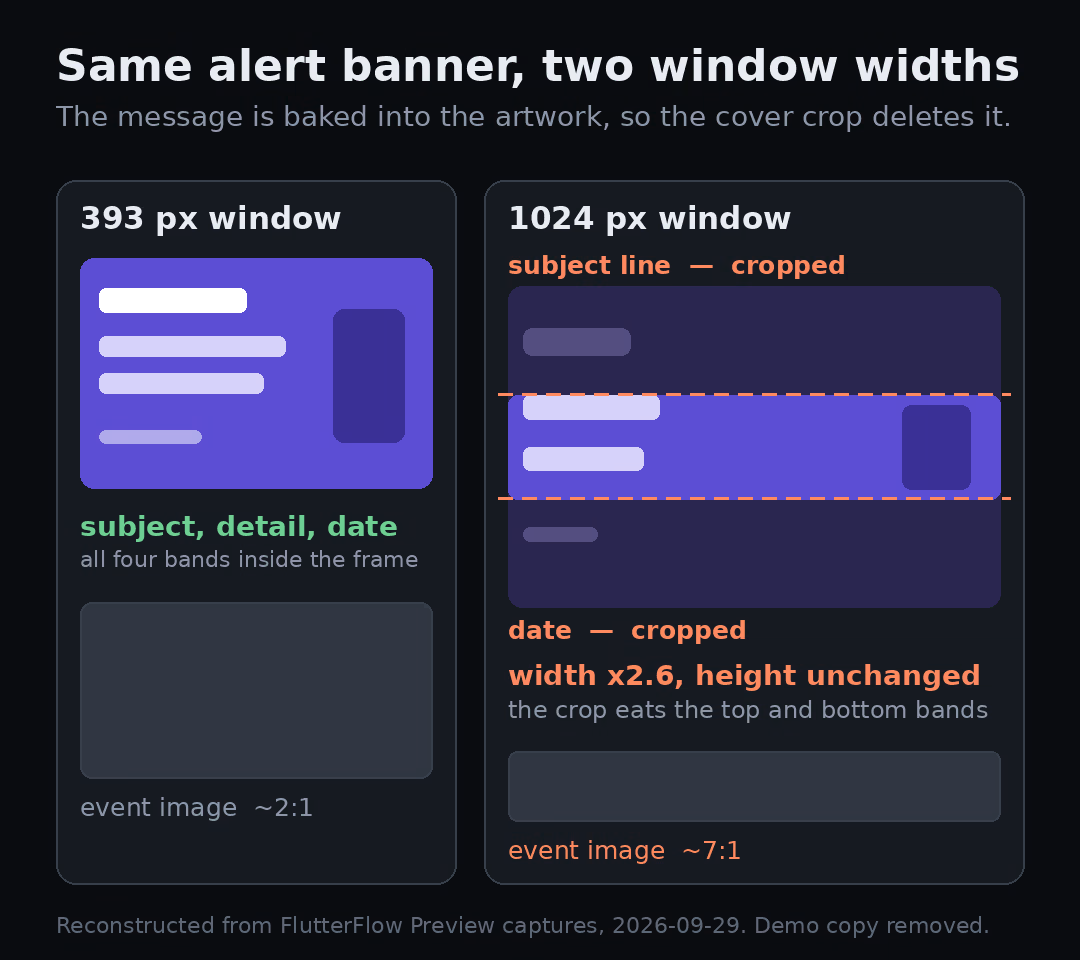
Both templates below are mine, both were captured from FlutterFlow Preview on 2026-09-29 at 393x852 and at 1024x1366, and the defects are in the rendered output rather than in anyone's description of it.
The first is Community UI App, a residential community dashboard. Its alert banner is a single raster image with the entire message baked into the artwork. In portrait you read a subject line, two lines of detail, and a date underneath. At 1024 px the banner keeps roughly its height while the width more than doubles, the cover crop eats the top and bottom bands of the artwork, and what survives is a sentence fragment with no subject and no date. The alert still renders. It just no longer says what is happening or when.
Directly below it, the event card's photo goes from roughly 2:1 in portrait to something near 7:1 at tablet width. A letterbox slot where a photograph used to be.
The second is Skillz, a learning dashboard. Nothing crops here. The problem is the opposite: in portrait the greeting lands about 160 logical pixels down and the first course cards sit inside the first viewport, while at 1024 px the greeting falls around 400 pixels down and the search field drifts to roughly 40% of a much taller screen. The column also runs the full 1024 px wide, so a search field designed for a thumb now spans an entire tablet. Flutter's best-practices page has a heading for this exact thing, and it is blunt: don't gobble up all horizontal space (Flutter adaptive design best practices).
Two templates, two opposite symptoms, one cause. Each was composed once, for one width, and then asked to survive arithmetic.
Everything I describe as a correction below is a proposed redesign rather than shipped behavior. The defects are verified from Preview captures; no interaction was runtime-tested in either project, so nothing here claims that search, navigation, attendance or persistence works.
LayoutBuilder or MediaQuery?
Use MediaQuery.sizeOf when the decision belongs to the whole app window, and LayoutBuilder when it belongs to the box your widget was handed. Flutter's guidance is that LayoutBuilder "provides the layout constraints from the parent Widget," so you get sizing for the specific spot in the tree where you placed it, while MediaQuery.sizeOf reports the app window itself (Flutter adaptive design, general approach).
The failure mode is using the window to lay out something that does not own the window.
MediaQuery.sizeOf | LayoutBuilder | |
|---|---|---|
| Measures | the app window | the constraints at that point in the tree |
| Rebuilds when | window metrics change | the parent passes different constraints |
| Right for | app shell, navigation, page-level branching | a card, a pane, a list tile inside a split view |
| Wrong when | the widget sits inside a narrow pane of a wide window | you need the main-axis extent inside a scrollable |
That last cell is the edge nobody warns you about until it bites. LayoutBuilder runs during layout and is for the case where "the parent constrains the child's size and doesn't depend on the child's intrinsic size" (LayoutBuilder API). Inside a vertical scroll view the cross axis is constrained and the main axis is not, so a height-based breakpoint there reads infinity and does something stupid. In a sliver context the counterpart is SliverLayoutBuilder. Reach for that instead of fighting the constraints you were given.
Breakpoints come from the window, not the device
Branch on available width, never on device type. Flutter states it directly: "your choice shouldn't depend on the type of device, but on the device's available window size," and the best-practices page lists if (isTablet) as something to avoid, because window size stopped tracking hardware once ChromeOS resizable windows, tablet multi-window, picture-in-picture, and foldables existed (Flutter adaptive design best practices).
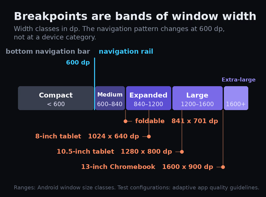
The numbers worth memorising are Android's window size classes, which Material's layout guidance shares. Google's Android window size class reference, current as of 2026, puts the compact class at under 600dp, covering 99.96% of phones in portrait, medium at 600–840dp covering 93.73% of tablets in portrait, and expanded at 840–1200dp covering 97.22% of tablets in landscape, with large and extra-large classes added above that to target desktop and connected displays (Android window size classes).
| Width class | Range | Window you usually see it on | Navigation I reach for |
|---|---|---|---|
| Compact | under 600 dp | phone portrait, small split-screen pane | bottom navigation bar |
| Medium | 600–839 dp | tablet portrait, unfolded inner display | navigation rail |
| Expanded | 840–1199 dp | tablet landscape, half a desktop window | rail plus a second pane |
| Large | 1200–1599 dp | large tablet, maximised laptop window | rail or permanent drawer |
| Extra-large | 1600 dp and up | desktop, connected display | permanent drawer, multi-pane |
Here's how that went on a real build.
BookBed runs from phones to desktop platforms from one Flutter codebase, but the booking calendar could not simply stretch. I fixed the timeline cells at deliberate interaction dimensions so drag math stayed consistent across platforms, then adapted the surrounding navigation and viewport. The reliable part was the calendar model; the shell was what changed with available space.
That split is the whole lesson from the BookBed property management build: some geometry is load-bearing and must not scale, and everything around it is negotiable. Deciding which is which is the design work. The breakpoints are just where you write the decision down.
Write the breakpoints down once
Material's own threshold for the navigation switch is the same 600: a bottom bar below it, a rail at or above (Flutter adaptive design, general approach). Pick the bands once, put them in a single file, and never write a raw number in a widget again. Actually, never is too strong. A widget that owns its own geometry can hold its own numbers; what must not be scattered across forty files is the breakpoint set.
Give every image an aspect ratio you chose
An image with no intended shape will take the shape of its container, and at tablet width that container is a letterbox. Community UI App's event photo is the proof. The fix is two lines of intent: wrap the image in an AspectRatio so the slot keeps a shape you picked, and set BoxFit so you know which dimension gets sacrificed when the frame and the source disagree.
The alert banner needs a different fix, and it is not a Flutter fix at all. Text baked into a bitmap cannot reflow, cannot scale with the user's text size, cannot be read by a screen reader, and gets destroyed by exactly the crop that happened here. Lift the sentence out of the artwork and render it as a Text widget over a background image or a solid surface. Then the banner can grow wide without eating its own message, and the copy survives at 200% text scale.
You have an asset like this somewhere. A promo card or an onboarding slide, with the words living inside a PNG because that was faster at the time. It works until the first wide window.
For the grid underneath, Flutter's large-screen guidance is specific: use SliverGridDelegateWithMaxCrossAxisExtent to define a max item width rather than hardcoding a column count, because "the number of columns should be based on the size of the window and not the size of the physical device," and wrap the whole thing in a ConstrainedBox with a maximum width so a reading column stays readable (Flutter on large screens and foldables). Skillz's full-width search field is one ConstrainedBox away from being fine. The same constraint discipline shows up in Flutter web SaaS dashboards, where the browser hands you an arbitrary width and nothing stops you from using all of it.
How should a layout handle a foldable hinge?
Split by width first, then let the platform move the seam: a foldable's inner display is one window with a physical obstruction running through it, and width alone cannot tell you where that obstruction sits. MediaQueryData.displayFeatures exposes "areas of the display that are obstructed by hardware features," where a hinge and a cutout obstruct the display and a fold is a crease rather than an obstruction (MediaQueryData.displayFeatures).
Two consequences follow, and the second one catches people. First, a 50/50 split computed from width can place a column directly under a hinge. Second, that property is populated only on Android and is empty everywhere else, so code that assumes a feature list will be there quietly degrades to a plain width split on iPadOS, desktop, and web. Design the width split to be correct on its own, then let display features move the seam when they exist.
State has to survive the resize
Treat every resize, rotation, and unfold as a configuration change your state must outlive. Flutter's best practices call for retaining and restoring state across device rotation, window size changes, and folding or unfolding, and recommend a PageStorageKey on scroll views so a list returns to its position rather than snapping to the top (Flutter adaptive design best practices).
This stopped being optional on Android. For apps targeting Android 16, API level 36, orientation, aspect ratio, and resizability restrictions are ignored on displays with smallest width at or above 600dp, which covers tablets, inner displays of large foldables, and desktop windowing. screenOrientation, resizeableActivity, minAspectRatio, maxAspectRatio, and setRequestedOrientation() are all ignored there. A manifest property named PROPERTY_COMPAT_ALLOW_RESTRICTED_RESIZABILITY buys you time, and the framework removes that escape hatch at API level 37 (App orientation, aspect ratio, and resizability on Android).
So the old answer, lock it to portrait and move on, now has an expiry date printed on it. Your app will be rotated and resized whether you wrote for it or not.
A test matrix you can actually run
Google's adaptive app quality guidelines, which replaced the older large screen app quality guidelines, name four configurations to test against. Run them in this order:
- Foldable, 841x701 dp. The awkward one. Nearly square, so width-only breakpoints land in strange places and any assumption about portrait or landscape dies here.
- 8-inch tablet, 1024x640 dp. This is the width where the two defects in this post appeared.
- 10.5-inch tablet, 1280x800 dp. Crosses into the large class, so a layout tuned for expanded gets a second look.
- 13-inch Chromebook, 1600x900 dp. Extra-large, resizable by the user at any moment, and the configuration that punishes an unconstrained reading column hardest.
Those dp figures come straight from the guidelines (Adaptive app quality guidelines), which sort apps into three tiers, from adaptive-ready at the bottom to adaptive-differentiated at the top.
Add a fifth pass of your own: drag a desktop window slowly from 500 px to 1600 px and watch the transitions rather than the endpoints. Most breakpoint bugs live between the sizes you tested, not at them. Checking that scroll positions and selections survive the drag costs nothing and catches the state bugs the matrix will not.
Heavier screens deserve a profiling pass too, since a two-pane layout renders both panes; Flutter list and image performance covers what that costs. And if you are still choosing a framework rather than adapting one, the React Native versus Flutter comparison is the better starting page.
Start with the one screen you already doubt
Open your app at 1024 px wide today, before any refactor, and screenshot the first viewport of your busiest screen. Then ask the only question that matters: can someone read what this screen is for without scrolling? Community UI App answered no because a crop ate the sentence. Skillz answered no because the sentence was below the fold. Both passed every build.
Which screen in your app would fail that screenshot right now?